


Table of contents
What is Tailwind CSS ??
How to install and configure ??
Core Concept
Layout
What is Tailwind Css ??
Tailwind css is the first Utility framework for css it is the fast and effective way to make web applications. It contains a set of css classes and tools to get started quickly. The beauty of tailwind is that we have independently construct a unique interface as it does not impose any specifications for design.
How to install and configure ?
There are two ways to install tailwind css one is via npm and the other one is by using cdn .
CDN comes with the limitation :
No installation of third party plugins .
Tailwind customized default theme cant be used .
TO use cdn you have to include the stylesheet inside the tag in the html for the tailwind css file via cdn:
<link href="https://unpkg.com/tailwindcss@^1.0/dist/tailwind.min.css" rel="stylesheet">
Getting started tailwind css via NPM
NPM is a package manager it is recommended to install tailwind css via npm as it provide easy maintainabiity of dependencies and libraries .
Note: To use Npm Node js is being installed in your system .
Follow these steps to start with tailwind css.
Step #01
Get into the folder were you have to save the work in tailwind.
cd Desktop
mkdir tailwindCSS
cd tailwaindCSS
C:\Users\92316>cd Desktop
C:\Users/92316\Desktop>cd tailwindCSS
Now check the version of your npm installed if not installed then install node js first .
npm -v
C:\Users/92316\Desktop\tailwindCss>npm -v
6.14.13
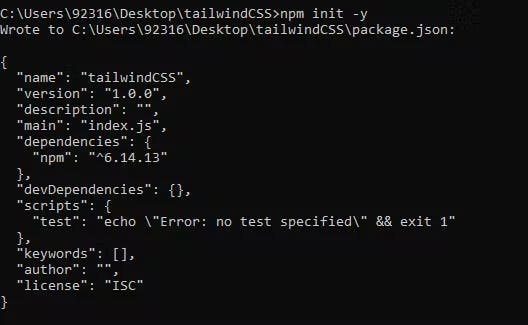
Step #02
Now you have to installed the package.json file to manage the dependencies.
npm init -y
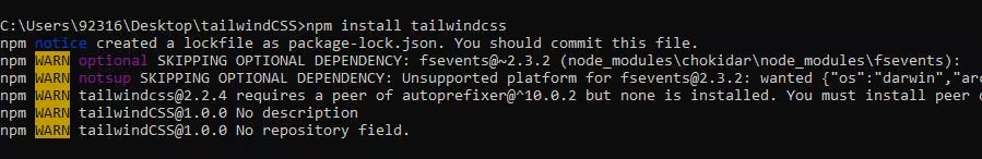
Step #03
Run this command to install the tailwind CSS locally.
npm install tailwindcss
Step #04
Create a local CSS file with the name tailwind.css and use the directive @ tailwind to inject base, component, and style utilities in your CSS file.
@tailwind base;
@tailwind components;
@tailwind utilities;
Step #05
In last, we have to run these commands for setting up the generated configuration file. It will generate one file, i.e., style.css. The file tailwind.css will be compiled over the style.css file.
npx tailwindcss build styles.css -o output.css
Note: Remember, you will not include the file tailwind.css with directives in the HTML code. Instead, style.css will be included.
Core Concept
1. Utility-First Fundamental
Whenever we have to style something on the web we have to write the whole big custom CSS .
With tailwind we can style elements by applying pre existing class directly into your HTML.
<div class="p-6 max-w-sm mx-auto bg-white rounded-xl shadow-lg flex items-center space-x-4">
  <div class="shrink-0">
    <img class="h-12 w-12" src="/img/logo.svg" alt="ChitChat Logo">
  </div>
  <div>
    <div class="text-xl font-medium text-black">ChitChat</div>
    <p class="text-slate-500">You have a new message!</p>
  </div>
</div>
In the example above we have used the pre existing classes :
Tailwind’s flexbox and padding utilities (flex, shrink-0, and p-6) to control the overall card layout
The max-width and margin utilities (max-w-sm and mx-auto) to constrain the card width and center it horizontally
The background color, border radius, and box-shadow utilities (bg-white, rounded-xl, and shadow-lg) to style the card’s appearance
The width and height utilities (w-12 and h-12) to size the logo image
The space-between utilities (space-x-4) to handle the spacing between the logo and the text
The font size, text color, and font-weight utilities (text-xl, text-black, font-medium, etc.) to style the card text
This approach allows us to implement a completely custom component design without writing a single line of custom CSS.
2. Handling Hover, Focus, and Other States
We can use this utility classes for hover focus and more of this .
Every class can be applied by some condition like we have to mention what element we have to target .
For example, to apply the bg-sky-700 class on hover, use the hover:bg-sky-700 class:
<button class="bg-sky-500 hover:bg-sky-700 ...">
  Save changes
</button>
When writing CSS the traditional way, a single class name would do different things based on the current state.
.btn-primary {
  background-color: #0ea5e9;
}
.btn-primary:hover {
  background-color: #0369a1;
}
Tailwind includes modifiers
Pseudo-classes, like :hover, :focus, :first-child, and :required
Pseudo-elements, like ::before, ::after, ::placeholder, and ::selection
Media queries, like responsive breakpoints, dark mode, and prefers-reduced-motion
Attribute selectors, like [dir="rtl"] and [open]
These modifiers can even be stacked to target more specific situations.
3. Responsive Design
In tailwind we have some existing classes with different breakopoints which make it very easy to build complex responsive interface without ever leaving the html.
There are five breakpoints by default, inspired by common device resolutions:
| Breakpoint prefix | Minimum Width | CSS |
| sm | 640px | @ media (min-width: 640px) { ... } |
| md | 768px | @ media (min-width: 768px) { ... } |
| lg | 1024px | @ media (min-width: 1024px) { ... } |
| xl | 1280px | @ media (min-width: 1280px) { ... } |
| lg | 1536px | @ media (min-width: 1536px) { ... } |
TO add the Utility all you need to do is prefix the utility with the breakpoint name, followed by the : character:
<!-- Width of 16 by default, 32 on medium screens, and 48 on large screens -->
<img class="w-16 md:w-32 lg:w-48" src="...">
Like in above case we defined a md breakpoint when the screen hits that breakpoint our width(w) increases to 32.
Mobile First
By default, Tailwind uses a mobile first breakpoint system, similar to what you might be used to in other frameworks like Bootstrap.
What this means is that if we want to apply a breakpoint on medium screen (768px) and we want that our text should be in center on the medium screen then it applies to medium as well as on the above screen size also .
<!-- This will only center text on screens 768px and wider,-->
<div class="md:text-center"></div>
Now what we have to do then :
So first we have to target the mobile devices which means the small devices and then override that style using the breakpoints.
Lets say we want to center the text in small screen so we can write simply text-center so it will apply to all the screen sizes. Now we want to lets say move the text in small and above screen so now sm:text-left it apllies the style from small screen and above.
<!-- This will center text on mobile, and left align it on screens 640px and wider -->
<div class="text-center sm:text-left"></div>
Layout
1.Flex
As we know inside tailwind their is some existing classes which we have to use so style our element.
So If we have to use flex we just need to write **flex** and now we further applied all the properties of flex.
To give Flex-direction:
flex-row    flex-direction: row;

flex-row-reverse    flex-direction: row-reverse;

flex-col    flex-direction: column;

flex-col-reverse    flex-direction: column-reverse;
Justify-content
justify-start    justify-content: flex-start;

justify-end    justify-content: flex-end;

justify-center    justify-content: center;

justify-between    justify-content: space-between;

justify-around    justify-content: space-around;

justify-evenly    justify-content: space-evenly;
2.Grid
Tailwind makes it easy to place these items in a grid. Simply add the **grid** class to the parent element and define how many **colums** you need with the grid-cols class.
<div class="grid grid-cols-4 gap-4">
  <div>01</div>
  <!-- ... -->
  <div>09</div>
</div>
Now let's add some space between the tiles. Again, this works by simply adding a gap with the **gap** class.
Going responsive
Making the Tailwind grid responsive works my using breakpoint prefixes. md:grid-cols-2 and lg:grid-cols-4 lets the grid automatically show the number of columns that works best for the viewport.
I hope this article has added value to your time.
If you like please do like and comment .
Thank you.